
The Earth, as seen from Apollo 17, December 7, 1972. Antartica is visible at the bottom of the image. People have been representing the surface of the earth on maps since the Bronze Age. Often, the map tells us more about the map-maker than it does about the earth and the people living on it.
MAP BASICS
Maps exist first of all in our imaginations. When we walk down the street to the home of a friend, we know how to get there because we have, in our minds, a mental picture telling us where to turn, how far to go, and what our friend’s house will look like when we arrive. If we want to share the same information with another friend, we might recite the directions orally or, if the directions are complex, put them on paper, perhaps with lines and arrows and little boxes to represent streets and houses. We would not want to put too many details on our map. The names of all the people in the neighborhood, the colors of their houses and the trees growing in their yards would only confuse your friend who just wants to find a single house. Too much information might get in the way of the map’s purpose. Maps communicate. The best maps communicate exactly the information needed and no more.
Most maps, of course, are not so specialized. They serve lots of different people with many different purposes—finding a specific house or business, planning an advertising campaign, organizing a hike, launching an invasion. . . . Use your imagination. Chances are, there’s a map for that.

This is a special purpose map published a few days after the Allied invasion of Normandy on June 6, 1944. It was intended for public consumption—no one wanted to tell the Nazis anything they didn’t already know—but it was intended to tell an American audience at least a little about the desperate battle still taking place in France.
The science and craft of map making is called cartography. Cartographers mix science and artistry to create their products.
There are maps of the moon and of the universe, of the human body, of cells and of molecular structures. There are even maps of mythical locations like Middle Earth, Narnia, and Hogwarts. In this essay, however, we are interested in maps of the earth’s surface. Maps are created to serve varied purposes, and reflect the intent of the map-maker as well as the expectations and needs of the map’s intended audience. The Catawba Deerskin Map shown below was created around 1720, by a members of the Catawba Nation in South Carolina and presented by one of their chiefs (or caciques) to Francis Nicholson, the new royal governor of South Carolina. The original deerskin map was lost, but Nicholson made two copies of the deerskin map, one of which now resides in the Library of Congress. The other is in the British Museum.

The map’s makers were not trying to show scale accurately. They created the map to show the relationship, as they understood it, between the English colonists living along the coast (represented on the left side of the map with straight lines and square fields) and the various Native American nations whose towns and villages are represented with circles. In reality—as everyone involved understood—the distances involved were far greater than the map seems to indicate. Towns were relatively small, and the distances between them measured in the scores and hundreds of miles. But the Catawba wanted to make a political point. Their chief town, Nasaw, is shown in the middle of the map and all of the other towns of the other Indian nations which made their homes in South Carolina are connected (on the map, if not in reality) to Nasaw by roads that, for the most part, run together in this most important of Catawba settlements. Even the English colony of Virginia, represented by the box on the right of the map, connects to Colonial South Carolina through Nasaw. This map is a statement of political and economic relationships as they were experienced by the Catawba at the time and as the Catawba wanted them to be understood by the British.
The Deerskin Map was intentionally not drawn to scale. Sites important to the map makers were drawn big. Things less important were drawn smaller. Details familiar to the map makers but not relevant to the purpose of this map—such as rivers, mountains, and swamps—were ignored. The writing on the map was almost certainly provided by the Englishmen who copied the original deerskin that still exists.
Many very useful maps continue to follow this same example If, for example, you wanted to ride the London Underground (what Americans quaintly call a subway), you would find this topological map, which excludes all irrelevant data, to be extremely useful.

The London Underground Map (or Tube Map) shows the many stops and connections on the city’s underground transit system while completely ignoring scale. If you are riding a subway, after all, you only need to know that, in three stops you will need to get off your Piccadilly train and get on Circle Line to get to where you want to go.
Ratio and Scale. If we were to create a map or model that was precisely the same size as the original, the ratio would be 1:1. Every square inch of the original would be represented by one square inch on the map. If the map were ten times smaller than the original, the scale would be represented as 1:10. Every square inch on the map would represent ten inches on the thing being mapped. On most ordinary, scaled maps—the kind you might use plan a trip—a scale will be marked on the bottom with the helpful notation that one inch (or one centimeter) on the map equals ten miles (or ten kilometers, or whatever the cartographer decides to use) in the real world.

The scale of the maps we use on a regular basis depends on what we will do with them. A map of the world with a scale of 1:29,802,000 would be about 46 inches wide, small enough to fit on a wall at home or school. If you are planning a trip around the world, such a map would be a good place to start planning, but for detailed information or if you wanted to plan a short bike ride, it would be useless.
Projections: Maps are flat. The surface of planet earth is decidedly not flat, being most often described as a globe though it is more precisely a slightly lumpy oblate spheroid. The representation of a spherical surface onto a flat piece of paper is called projection. The curved surface of the earth is of relatively little importance when making maps of individual towns, but any picture of the entire earth or even a substantial part of it will force the map maker to decide how to represent curved space on a flat surface. There are a number of options, all of which have limitations and advantages and most of which involve fairly complex, three-dimensional geometry. You can become acquainted with the problem of map projections by peeling an orange—keeping the peel in one piece—and then trying to get it to lie flat.
The photograph of earth, taken by the crew of Apollo 17 in 1972, demonstrates part of the problem of map projection. Obviously, only half of the planet can be seen at one time, and at the margins of the image—where the earth is curving away from our view, the image is distorted. Even when NASA helps us by providing two separate images of the Eastern and Western Hemispheres, we find parts of Africa, Asia, and South America becoming lost on the margins of the visible sphere.

By Reto Stöckli (land surface, shallow water, clouds)Robert Simmon (enhancements: ocean color, compositing, 3D globes, animation)Data and technical support: MODIS Land Group; MODIS Science Data. Public Domain, https://commons.wikimedia.org/w/index.php?curid=306260
NASA helps us out again by combining multiple photographs of the earth, all taken from space, and stretching them across a flat surface, giving us a more familiar picture of the planet on which we live. This time-lapse image also shows the expansion of snow cover in winter and the greening of the temperate zones in summer.

NASA images by Reto Stöckli / Public domain
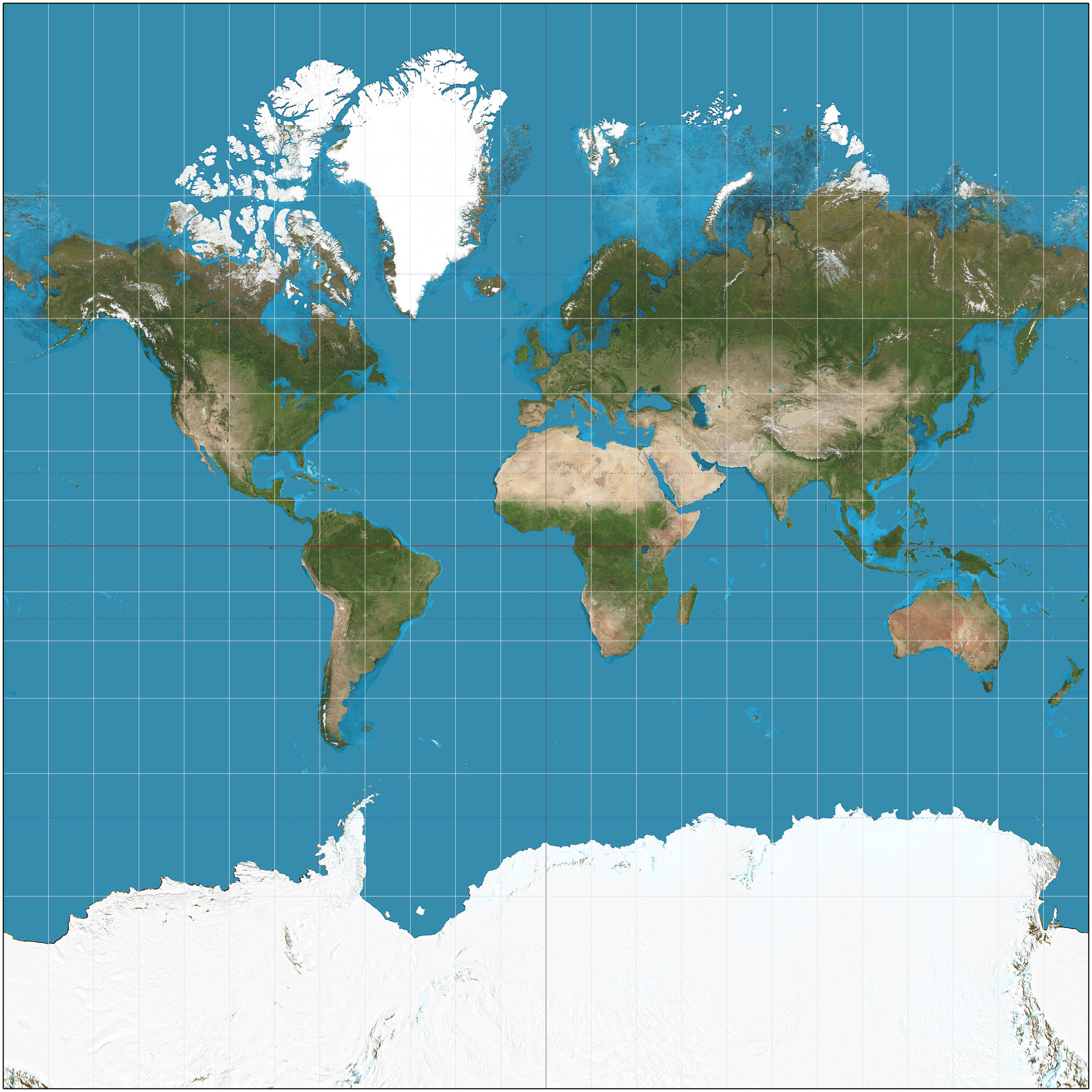
Image derived from NASA data by Daniel R. Strebe.
The limitation with this map, however, is that it makes Greenland, Canada, Russia and Alaska look far larger than they actually are in proportion to the rest of the earth, while Australia, Africa and South America shrink into seeming insignificance. And the Antarctic is stretched into unrecognizable proportions. We shouldn’t blame NASA, however. Their map was based on a projection first used in the sixteenth century by Gerardus Mercator. If you look closely at a globe, you will probably notice that the lines of longitude (which run north and south) converge at the North and South Poles. Mercator’s map pretends otherwise. At the equator, all lines of longitude are precisely 111.3 kilometers (or about 69.16 miles) apart. At the poles, degrees of longitude are precisely zero miles apart. In order to draw them as straight lines, we have to smear out the polar regions. This was not a big problem in the sixteenth century when no one was interested in sailing too near the poles, but in the twentieth century, the problem became obvious. It is useless in long distance air travel, for example. Looking at this map, one would never guess that the shortest route between New York City and Beijing, China is over the Arctic Ocean.
If you want to learn more, take a look at the online textbook, Understanding Map Projections.
It also raises another issue. Why is the north at the top? If the earth is a globe, then it has no top or bottom. Concepts like up and down, which make perfectly good sense on the surface of the earth, have no real meaning in space. Putting the north pole at the top of the map is a convention—something we have come to expect of maps—but it makes just as much sense to put the South Pole at the top. And that raises another important question. Does turning the world upside down change the way we look at it? Most of us tend to assume that things at the top of an image are more important than things at the bottom. Perhaps putting Australia, Africa, and South America in the dominant positions allows us to see things from a different and useful perspective.

Maps serve an almost infinite number of purposes. A long-haul truck driver needs maps of the Interstate highway system. She wants a map to show truck stops, rest areas, and weigh stations and not a great deal else. A prospective home owner (or an insurance agent considering insuring that same home) might need a map showing places where flooding is most likely.
This image of North and South Korea was taken at night. What information does it provide that a typical map does not? What does it tell us about North Korea compared with South Korea, China, and Japan?

Latitude and Longitude.

https://commons.wikimedia.org/wiki/File:Azimutalprojektion-schief_kl.jpg
The two poles, the arctic and antarctic circles, and the equator, are “imaginary” in that there is no physical marking on the ground or sea to distinguish them. But they are nonetheless real. North of the equator—even a few yards north—water draining from a sink will spin in a clockwise direction. South of the equator, the direction of spin is counterclockwise. Directly on the equator, water just bubbles straight down. Hurricanes and tornadoes do the same thing, spinning clockwise in the northern hemisphere and counterclockwise in the southern. This is called the Coriolis Effect. If you want to demonstrate it for yourself, try throwing a tennis ball to a friend (or other target) on the opposite side of a merry go round. If you throw the ball straight at your target, by the time it gets there, the target will have moved several feet ahead and the ball will appear to have curved away from the target.

Image by Hans Bezard.
If you want to determine how far you are from the equator (at least in the northern hemisphere) all you would need is a cloudless night with a view of the North Star (or Polaris) and a clear view of the horizon (such as you would have at the beach. If you are standing on the equator, the North Star will be barely visible on the horizon (an angle we can call “0” degrees if it is visible at all. Standing on the North Pole, the North Star would be directly overhead (or at a ninety degree angle from the horizon). From any other point in the northern hemisphere, locating one’s latitude is a “simple” task of measuring the angle of the North Star from the horizon. When the North Star appears at a 35 degree angle above the horizon, we can confidently say that we are at 35 degrees north latitude. Finding our latitude in the southern hemisphere is made more complicated by the absence of a bright star conveniently located above the South Pole, but it is still possible.
Locating our latitude is extremely useful, but a sailor intending to sail from Ireland to Boston, for example, would need to know her longitude as well. Lines of longitude, of course, are the imaginary lines map makers draw to connect the north and south poles. Lines of latitude start at zero (on the equator) and culminate on the North or South Poles (at 90 degrees north latitude or 90 degrees south latitude). The line representing zero longitude is drawn from the north to the south poles through the small town of Greenwich, England and the Royal Observatory located there. The rest of the globe is encircled by 360 lines of longitude, so if you know that your latitude is 34.116998 north, and your longitude is 80.938892 west, then you know that you are conveniently located at Ridge View High School in South Carolina.

As recently as the early Twentieth Century, some parts of the earth remained unmapped and unexplored (at least from the perspective of Americans and Europeans). This map of Africa from 1857 was made as the interior of Africa was just beginning to be explored by Europeans. Some parts are shown in great detail—the coastline especially—but the Congo River—one of the greatest rivers in the world— is completely missing. These blank spots on the map proved irresistible for explorers of the late 19th century, and for the countries of Europe which carved Africa into colonies. After World War II, Africa re-asserted its independence, re-making once again the way this vast continent was perceived by the world.
In the 21st century, much of the ocean floor remains unmapped, even as explorers are also turning their attention to the surface of Mars and to the distant exoplanets that orbit stars hundreds of light years beyond earth. Just as the blank sections on the map of Africa drew explorers in the nineteenth century, the unknown worlds of inner and outer space call to explorers of the twenty first century.
Definitions:
Types of Maps:
Reference Maps
Thematic Maps
Spatial Patterns represented on Maps
Absolute and relative distance
Direction
Clustering
Dispersal
Elevation
Selectivity in Information
Map Projections and Distortions
Relationships in shape, area, distance and direction
Data Analysis
Different Types of Data presented in maps, quantitative data, geospatial data.
Data Collection
Geospatial technologies
Spatial Information
Spatial Concepts
Absolute and relative location
Space
place
flows,
distance decay
time-space compression
pattern
Human-Environmental Interactions
Environmental Determinism
Environmental Possibilism
Scales of Analysis: global, regional, national, local
Regional Analysis
Region: one or more unifying characteristic or pattern of activity
Formal, functional, perceptual/vernacular
Regional boundaries: transitional, contested, overlapping
Regional analysis can be applied at local, national, and global scales.